

Patrick Robert Doyle / Unsplash
When you have to do a big presentation in front of a big crowd, the pressure can be daunting.
It’s great if you have already composed the details and laid out the contents for your speech. However, if you don’t have enough background in graphic design, it can be tough to design unique presentation decks. And sometimes, hiring a professional PowerPoint presentation designer can take up a lot of your money (and sometimes, time).
So, why does building a presentation deck design yourself better than asking someone to do it for you?
You’ll get to know the answer in a bit, but first, you must understand a pitch deck presentation.
What Is a Presentation Deck?
It’s good to start asking, “What is a deck presentation?”. A presentation deck is a visual aid to your demonstration, talk, lecture, or whatever your purpose will be. Since you will be disseminating a lot of vital information to an audience, it is crucial to get help from slide visual aids.
Why? You could deliver your speech and let people take down notes, right?
The answer is no, my friend.
The reason why you need slides is that people can process visuals faster than they can process text. So while reading and talking about your presentation, your audience will be able to follow your thoughts and understand you.
Best Practices for Having an Amazing Presentation Deck
Now, you may already have tricks up your sleeve on presenting a pitch deck, board deck presentation, or business plan presentation deck. You may even have the best communication skills in your organization.
If you want to deliver the best presentation and make it more effective, follow our tips on designing a slide deck presentation.
1 .Replace Words with a Photo.
If your draft has plenty of words, don’t ever think about typing all that into your slide. Instead, if possible, use photos to convey your message visually.
Photography is helpful in many situations. For example, you can use it to feature your product, deliver an emotional statement or enhance boring slides.
On the other hand, don’t use too many photos; your presentation is not a portfolio.
2 .Maintain Consistency Throughout the Whole Deck.
To create a fantastic slide presentation, you’ll need to decide on the overall design, such as typography, color, and layout. If you or your company has existing branding guidelines, you should stick to that.
However, suppose you’re starting from scratch. In that case, we recommend that you use one or two font styles in the entire deck, including your slide title, headers, and sentences.
For color, it’s essential to find and follow color schemes that suit your presentation. However, don’t go overboard with colors and use unnecessary shades. Doing that will just distract your audience.
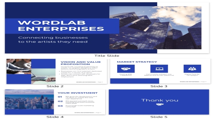
See the presentation deck template from Venngage below if you need an example.
3 .Say “No” to More Texts.
When it comes to using words in a presentation, less is more. While it may be very tempting to put too many words on a slide, especially if you have plenty to discuss, you should avoid it.
Instead, leave out unnecessary phrases or simplify your sentence. Whenever possible, format them into bullet points. Then, perhaps, replace some of your texts with captivating visuals such as relevant icons, images, or infographics. Infographics are another source of visual aid, such as charts and graphs, that simplify complex data.
Not sure where to find and use infographics? We have them on our digital infographics maker.
4 .Welcome and Apply Simplicity.
There is a golden rule that all presentation designers follow: the 1:1 ratio.
It means that you should keep one idea per slide. If you use text and images wisely in your slides, they are enough to support one concept.
If you follow this practice, it establishes a straightforward narrative for you and your audience. Also, simplicity is applied in transitions and animations, so don’t overload them.
5 .Deal with White Space Effectively.
Lastly, white space, also called negative space, is somehow the breathing room between your text, elements, and infographics. You need to have enough white space in your design. Avoid putting too many elements on a single slide or making them too big. Otherwise, your presentation will come across as cluttered and unprofessional.
Final Thoughts
Applying these best practices will get you started in building an impressive and visually engaging presentation deck. Also, be on the lookout for ways to improve because presentations are always around the corner for someone like you (because why would you be here in the first place?).
This is not a one-time thing. So, an excellent way to begin is to design with Venngage, a digital infographic creator. It’s easy to use, even if you have no previous experience designing or editing! To get started, sign up for an account — it’s for free!